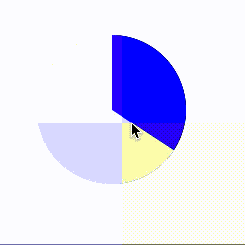
html
<div class="round"></div>
css
使用background-image渐变属性和动画状态的伪元素遮盖来实现:
.round {
  width: 150px;
  height: 150px;
  border-radius: 50%;
  background-color: #eee;
  background-image: linear-gradient(to right, transparent 50%, blue 0);
  position: relative;
}
.round::before {
  width: 50%;
  height: 100%;
  content: "";
  position: absolute;
  top: 0;
  left: 50%;
  border-radius: 0 100% 100% 0 / 50%;
  background-color: inherit;
  transform-origin: left;
  animation: spin 5s linear infinite, dye 10s step-end infinite;
}
@keyframes spin {
  to {
    transform: rotate(0.5turn);
  }
}
@keyframes dye {
  50% {
    background: blue;
  }
}s
效果